
UPDATE: I have a post with the most recent data here.
It’s been a while since I talked about all-cause mortality data for the USA so I wanted to look at the most recent numbers. Just as a refresher, all-cause mortality data is so important because it’s unambiguous. Doctors may diagnose a particular death as due to one cause or another for a variety of reasons, but they all diagnose a dead person as having died. For example, did someone with COPD and COVID-19 die of the COPD or the COVID-19? Both answers are legitimate, and either might be preferred for a variety of reasons. No matter what the doctor who signs the death certificate puts down as the cause of death, though, he puts down the fact of death just the same. A trend for diagnosing death in a particular way might look like an underlying trend in the disease when it’s really just a trend in bookkeeping. Or a trend in diagnosis might make a new disease seem like it’s not killing people when it is. Looking at the absolute number of people who are dying, regardless of cause, can help us tell the difference. That’s why it’s so good to look at all-cause mortality. It doesn’t tell us much, but at least it can’t lie. So, without further ado, let’s look at the most recent data. (As before, you can get the data and see the latest data after this post becomes outdated here.)
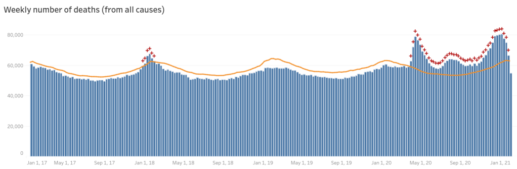
Always ignore the data for the most recent week, and based on recent trends the second most recent week is likely to change a lot, too. It takes oddly long for mortality data to come into the CDC (up to two months to get all of it), so they have to do some guesstimating on more recent weeks. In the last few months they’ve tended to under-estimate rather than over-estimate it (I believe around six months ago they were over-estimating it a bit and over-corrected from that). Accordingly even a few weeks back may increase some. (Later on in this post I have a comparison to what this looked like a month ago so you can see for yourself.)
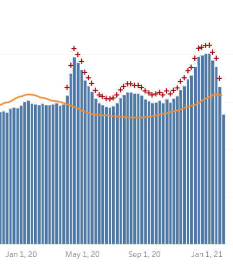
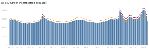
The orange line is the threshold for “excess mortality”, i.e. if the all-cause deaths/week is above that, this is more than we would expect from normal variation, based on previous years, and there might be something up. They also helpfully put a red plus sign above each week where the mortality exceeds the excess mortality threshold. Here is a zoomed-in shot to the last year or so:
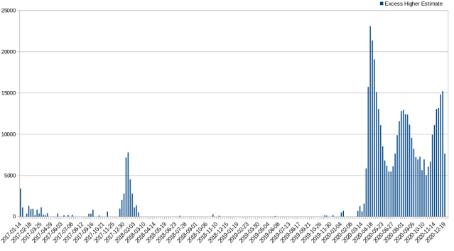
Unfortunately this format, though good for having a sense of what’s going on with overall mortality, doesn’t make it easy to compare excess mortality across weeks since there is normal seasonal fluctuation in deaths. To help with this, I downloaded the data as a CSV file from their website and created a graph of excess mortality that’s much easier to compare (note that this is the full data, i.e. going back to January 2017):
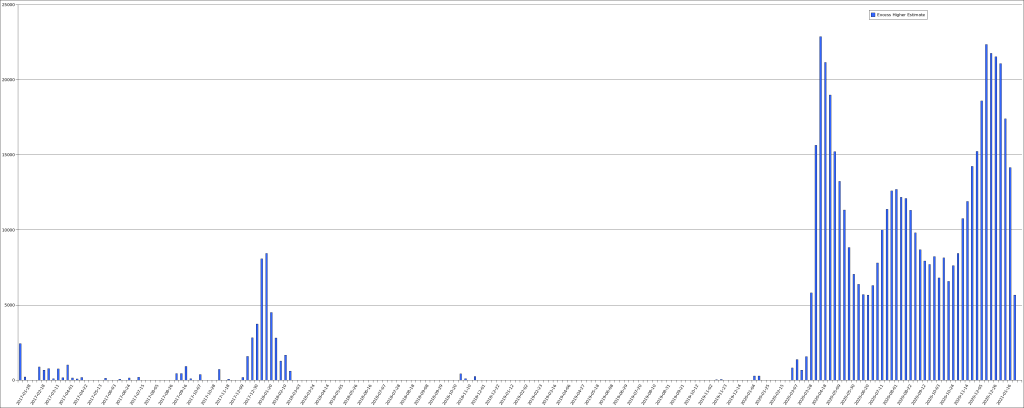
This third wave is turning out to be the biggest yet, at least in terms of area under the curve. That said, since the definition of excess mortality is only a guess, though a guess made by applying statistics to historical data, I don’t think that we can put much stock in small differences. That is, the first wave having a very slightly higher peek in excess mortality probably doesn’t mean much. On the other hand, its peak was during the time when mortality is normally going down (heading into spring) while the peak in excess mortality in the third wave was close to the worst time (winter). Probably the best thing to do is to not worry about small differences and consider them equivalent in peak, but with the peak being sustained longer in this third wave.
The third wave looks like it has peaked but unfortunately the data isn’t really reliable enough to tell, yet. Here is the graph from my previous post, which only contained data through January 1st:
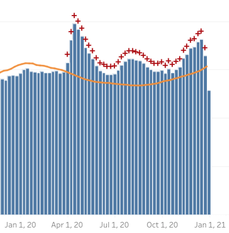
That had looked like it was peaking, too, and it turned out that even several weeks back on that graph were still incomplete. Again, for reference, here’s the graph I made from the CSV data at the time:
This may make it even clearer how far back the data can be revised. One thing that’s very clear is that, as a country, we need more timely mortality reporting. Having to wait two moths to get accurate data makes the data hard to use for any practical purpose. I do get that there will always need to be some revisions—someone who dies at home and is only discovered days or weeks later, for example—but it’s hard to believe that this is such a large fraction of deaths. It seems far more likely that antiquated reporting standards are to blame. That said, I don’t know that for sure; I think it is worth spending resources to find out why the data takes so long to be reliable.
So, given that the data is subject to revision, if diminishing revision, for up to two months, what can we make of this data? Not a whole heck of a lot, frankly. Just to refresh our memories, here’s the latest graph one more time:
It is inarguable that something is going on; it is equally inarguable that this is not the second coming of the black death (which killed off around a third of Europe). It is clear that we’ve had three waves of significant excess mortality, which do correspond pretty well to the three waves of COVID-19 infections we’ve detected as well as the three waves of deaths attributed to COVID-19. It is, of course, not possible just from these numbers to say what is up, however. It could be that COVID-19 is killing people. It could be that lockdowns meant to stem the flow of COVID-19 are killing people. It could be that there are homicidal maniacs running about killing extra people in three waves. This is the limitation of all-cause mortality. That said, if you compare the numbers of COVID-19 attributed deaths and excess mortality, they actually do tend to line up reasonably well. I don’t have the time to generate the side-by-side graph of that which would make it clear just how closely they do or don’t track, this is just me having done some quick approximations, so take it with at least one grain of salt, more being better.
Assuming that the numbers in December 2020 are not revised higher, I do find it interesting that the excess mortality was not significantly higher, on a weekly basis, than it was during the peak of when COVID-19 first hit the US. COVID-19’s first entry was only into some locations. Though it spread quickly, it was doing this spreading during the time when the weather was getting mild and people tended to be outdoors, which seems to correlate with when COVID-19 infections (and deaths) are at their lowest. During the third wave, COVID-19 was already well spread out through the country, such that when winter set in and infections began to spike, it didn’t need to spread in order to bloom everywhere.
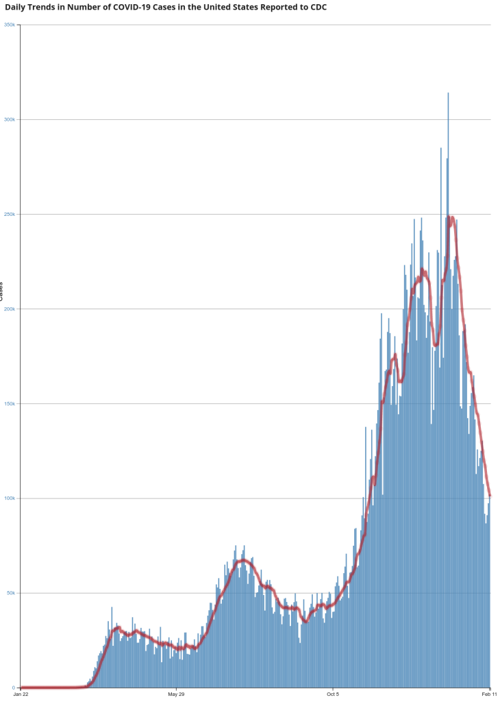
Though infection numbers are not directly comparable across time because testing is so much more widespread and available as time progresses, testing was pretty available by the middle of the summer, so you can see COVID-19’s prepositioning for the third wave in the infection numbers:
In spite of these advantages that COVID-19 had in the winter of 2020 over the spring of 2020 we don’t see a similarly massive increase in all-cause mortality. There are various possible explanations for this but the data doesn’t really support any of them better than the others, so far as I can tell. It may be that the virus spread far more widely among the population during the first wave than we had any idea of. It may be that the most vulnerable people already died from COVID-19 in the first two waves, or it may be that treatment got better, or it may be that the virus became less deadly, or it may be that we got better about isolating the most vulnerable people. It may be a combination of all of these things, each contributing something to the outcome. Undoubtedly there are other possibilities I didn’t name, too.
I don’t have any grand conclusions to this post; I don’t make these posts about the all-cause mortality data to argue for any particular point. My goal is to highlight the little bit of highly reliable data we have, because I think we’re all better off if we’re at least familiar with it.
Discover more from Chris Lansdown
Subscribe to get the latest posts sent to your email.

Pingback: All-Cause Mortality Data for the USA – Chris Lansdown
Pingback: All Cause Mortality – Chris Lansdown