
Update: I’ve got a post with the most recent data (through April 3, 2021) here.
I previously wrote about finding All-Cause Mortality Data for the USA. Since I’m seeing hits for that, and the post is somewhat old, I figured I’d make an updated post with the latest information. (As before, you can get the data here.)

And to zoom in a bit on the last year of data:
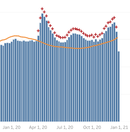
As before, disregard the blue bar all the way on the right. That data is only 10 days only, and it only starts getting close to complete at about 17 days old (i.e. after being on this chart for two updates. It isn’t fully complete until it’s two months old, though as I’ve been watching it, it tends to change very little after about 24 days (i.e. after the week has been on this chart for three updates). That said, with Christmas and New Years happening so close together, it wouldn’t surprise me if the data took a little longer to come in than usual, which would mean the most recent few weeks might be a bit under-represented.
The orange line is the “excess death” line, which is a statistical threshold that indicates when deaths (from any cause) exceed what we’d expect within normal variation, and there is probably something going on. (That said, there was a cluster of excess deaths around January 2018, and I don’t know that there was any specific cause ever found for that.) It is not constant because there tend to be more deaths in winter and fewer in summer; its exact value isn’t overly meaningful, but it works fairly well as a trend line.
As you can see, there have been three distinct waves of excess mortality, which correspond to the arrival of COVID-19, air conditioning season in the south, and winter. Whether that’s actually the cause of it, the data itself does not say, of course, though they are at least reasonable suggestions. It is also interesting to note that the magnitude of the waves is not equal; the all-cause mortality was highest in the first wave.
As I mentioned in my first post on the subject, all-cause mortality data is so important because it does not involve interpretation. Whether someone with COPD who caught COVID-19 and died was killed by COPD or COVID-19 is a matter of interpretation, and there are reasonable arguments to be made on both sides. Whether they’re dead is not a matter of interpretation. It is thus a number one can look at without having to do great research into it, and further it’s a number that can directly be compared across medical systems, countries, etc. The trade-off is, of course, that it is very limited in what it tells us. In this case it does clearly tell us that something has been going on because mortality has been elevated relative to previous years, and moreover elevated in three distinct waves. It also tells us that mortality has not been very elevated, and that the severity of the waves is not getting worse, and may even be a little bit better.
Update: I pulled down the CSV of the data and graphed just the excess deaths, to make the three waves more directly comparable.

(As in the graphs above, ignore the right-most week as the data is almost certainly significantly incomplete.)
This makes it much clearer that the third wave is, so far, a little bigger than the first. With the last week being almost certainly incomplete, there is, at present, no reason to suppose it’s over, from this graph. As I said in my previous post on the subject, I think it’s too early to make predictions. It is not, however, too early to rule out some predictions that people have made. There are certainly more than enough contradictory predictions that some of them have to be proven wrong, by now.
Discover more from Chris Lansdown
Subscribe to get the latest posts sent to your email.
