
It’s been a while since I wrote about all-cause mortality for the USA, and I’ve been meaning to write an update. With the curious incidence of the omicron variant (if that’s what’s responsible), this has become more timely. So, first, here’s the most recent all-cause mortality data for the USA:
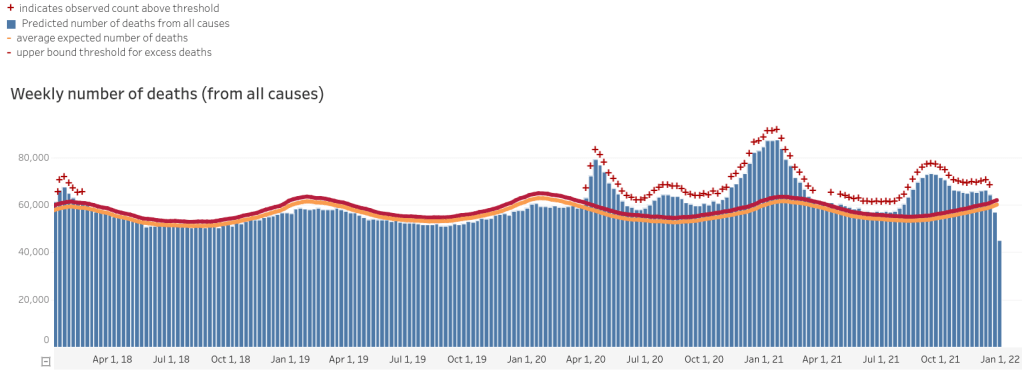
And let’s zoom into the last year and a half:

As you may notice, the average and upper-bound threshold lines are thicker than they used to be; this is to better represent the statistical uncertainty involved in them. Please note that the last two weeks are almost certainly under-reporting of deaths, because the USA is bad at reporting all-cause mortality until about 4 weeks later (a week only makes it onto the chart when the last day in the week is 10 days ago, but even so the first few lines on the right always under-count, though by how much varies). I’m not sure why we’re so bad at it, but we are, so that’s the grain of salt with which to take those last numbers.
Looking at these graphs, it seems like not much is going on in the last few months. Mortality is slightly raised from normal, but not by very much. It’s still the case that if you scales the y-axis not to the highest number of deaths per week but to the US population (329.5 million, as of 2020), the weekly all-cause mortality would barely be distinguishable from the x-axis, i.e. you wouldn’t be able to visually tell that anyone is dying at all.
Now let’s consider COVID-19 statistics (also from the CDC):
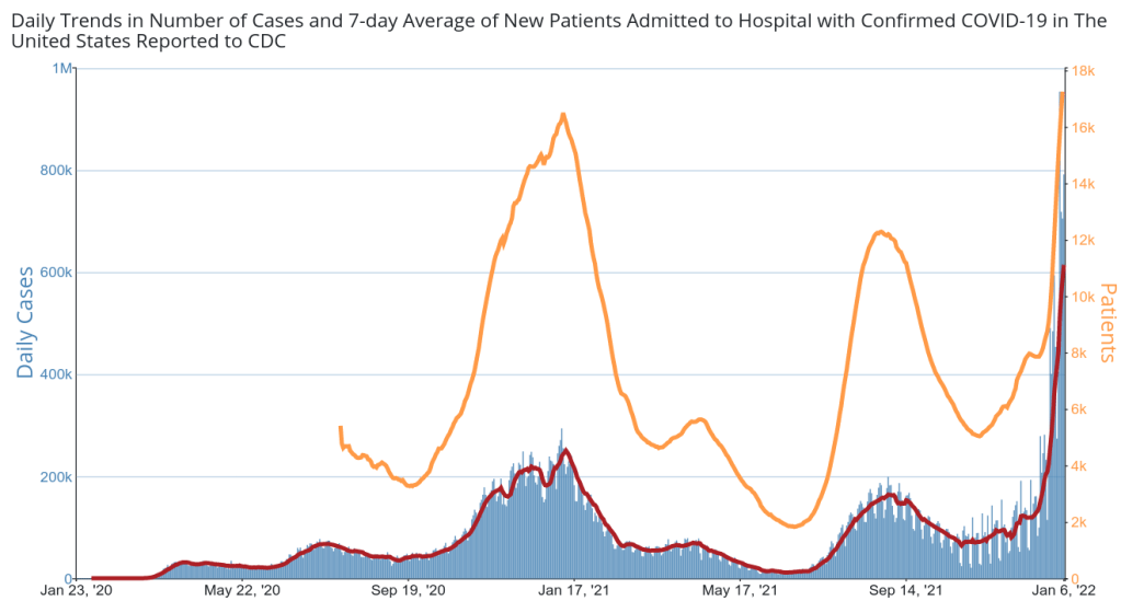
As it says in the graph, the red line is the 7-day average for daily new cases, and the orange line is daily new hospital admissions for COVID-19. Let’s also look at the daily deaths the CDC attributes to COVID-19:

The orange line is the same daily new admissions for COVID-19 (and thus the same line). The red line is 7-day average of deaths attributed to COVID-19. As I’ve mentioned before, this is intrinsically a less reliable number since reasonable people and indeed reasonable medical guidelines can differ as to what the cause of a death is in the case of multiple interacting causes. To give an example, if someone has COPD and catches COVID-19 and dies, which killed him? He’d have eventually died of the COPD, but died earlier than if he hadn’t caught COVID-19. Both answers are reasonable, and the logic behind them is lost when these are aggregated into statistics. That’s why all-cause mortality is so important—everyone diagnoses death itself the same (the exceptions being statistically irrelevant).
All that said, the CDC’s statics on COVID-19-attributed deaths are still interesting to look at, over time, since the judgement as to the attribution of the cause of death is likely to be the same, over time. It’s not guaranteed, of course, but it is likely in the absence of large cultural shifts.
These various graphs are interesting, but the one I find the most interesting is the bottom one—COVID-19 attributed deaths vs. COVID-19 attributed hospital admissions.
Naively, you would expect the two graphs to look very similar but with a slight right-shifting of the death line since people tend to be admitted to the hospital then die some number of days later. Similarly, once the prevelance of the SARS-CoV-2 virus in the population goes down, you’d expect the admissions to start going down and then the deaths will start going down a bit later as the people who were already admitted who are going to die, do so. And we in fact do see this relationship from roughly September of 2020 until about March of 2021. It’s wider than we’d expect to see—somewhere around a month—but it’s there. The line of deaths that we’re looking at is a 7-day average, and the hospital admission line is too smooth to not be some kind of average, so possibly the horizontal distance between them is partly just about how the statistics are collected rather than reflecting the real day-to-day numbers.
After March of 2021, the relationship we would expect to see breaks down. Around April of 2021 we see a spike in covid-related hospital admissions while there is a decline in covid-attributed deaths. In June through august of 2021 we see the relationship seem to come back, but the distance between the bars is now bigger, and the lines no longer have the same basic shape. Hospital admissions also spike much higher relative to the previous trough than do deaths (bear in mind they’re not on the same scale, so their heights can’t be directly compared, only their shapes can be compared). Then the falling in admissions actually lines up, for a while, with the fall in deaths, which it shouldn’t. After that, there is no apparent relationship between the two.
If you look back at the graph of daily cases, the hospital admissions actually coincides much better with it’s 7-day average daily-cases line. I don’t know of a great explanation for that; it’s just interesting to note that hospital admissions track positive COVID-19 tests far better than they track deaths. (Again, the y-axes are very different so you can’t compare the lines and hospital admissions are a drop in the bucket of positive COVID-19 tests so you can’t attribute the rise in positive COVID-19 tests to increased hospital admissions.)
As before, my main conclusions are that the USA’s all-cause mortality data is hopelessly laggy and that the other data available still doesn’t support any obvious conclusions. We’re very clearly not facing any kind of existential threat and anyone who tries to take emergency powers appropriate to an existential threat should be thrown out of office as soon as possible. Beyond that, I think that SARS-CoV-2 and COVID-19 continue to illustrate how little we know about the natural world.
Discover more from Chris Lansdown
Subscribe to get the latest posts sent to your email.
